Case Study

How Curvati Achieved an 8% Conversion Increase

A complete Shopify redesign that turned a powerful brand story into a conversion-optimised customer journey - increasing the conversion rate by 8% even as total sessions fell by 41%. Following the redesign, the store achieved a 2.29% conversion rate-an 8% relative improvement compared with the previous period.

2.29%

Increase in conversion rate

+8%

Relative conversion-rate improvement

6.21%

Sessions resulting in an add to cart

4.27%

Sessions reaching checkout

2,710

Completed checkouts during the measured period

About the Brand

A Meaningful Brand That Needed a Complete Digital Experience

Curvati was not selling ordinary jewelry.
Every product is built around the brand’s signature curve-a design inspired by the founder’s daughters and intended to remind customers that they were created with purpose, beauty and worth.
The challenge was translating that emotional story into an e-commerce experience that could also sell effectively.

The store needed to communicate:

  • What makes Curvati different
  • The meaning behind each collection
  • Why the jewelry is worth purchasing
  • Which design is right for each shopper
  • The materials and craftsmanship behind each piece
  • Whether the product is suitable for everyday wear or gifting
  • Shipping, returns and payment information
  • Why shoppers should feel confident buying from the brand

01 Homepage

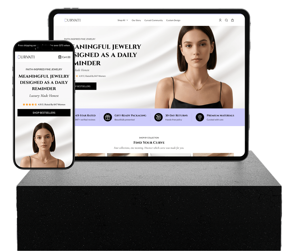
The homepage needed to establish the brand’s identity immediately while giving visitors a clear route into the shopping experience.

We introduced a more structured hierarchy around:

  • Faith-inspired fine jewelry
  • Products starting from an accessible price point
  • Review and trust signals
  • Free shipping and return reassurance
  • The meaning behind the signature curve
  • Featured products and collections
  • Craftsmanship and product quality
  • Brand community
  • Email capture

The current homepage introduces the offer with "Faith-Inspired Fine Jewelry From \$59," followed by free shipping, returns and sizing reassurance. It then connects visitors with the brand story, featured jewelry, and community.

02 Collection Discovery

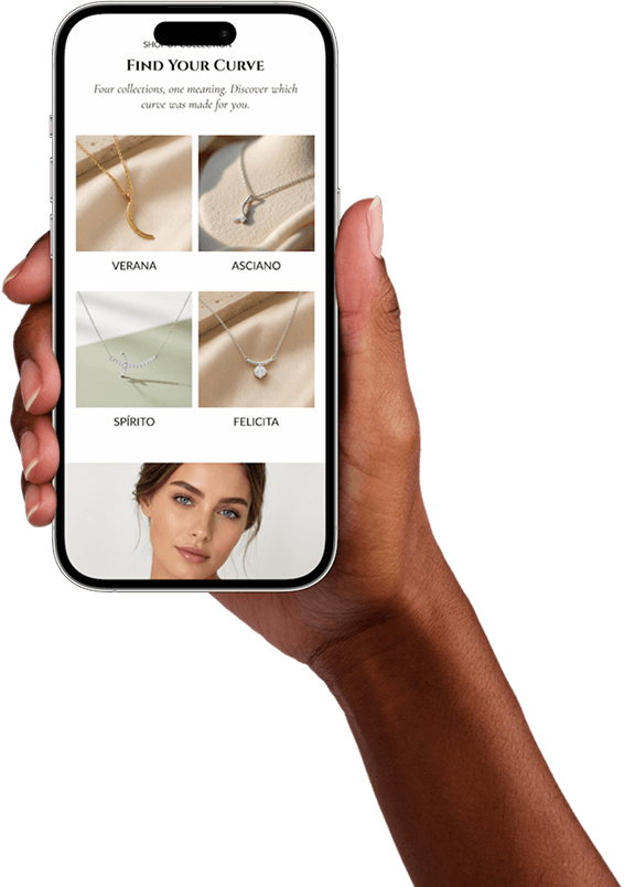
Curvat offers multiple collections with different designs and meanings. The shopping experience needed to help visitors understand these differences rather than presenting one undifferentiated product catalogue.

We created dedicated pathways for:

Verona Petit-Sill Asciane Split-Is

Each collection was given a distinct positioning, emotional message and visual identity.
For example, Verona focuses on the original signature curve and everyday elegance, while Asciane presents more distinctive, freeform designs. Split-Is emphasizes faith and purposeful design.

Why this mattered:

Customers could browse by meaning and personal style—not simply by product type.

03 Shop-All Experience

The main collection experience was designed to answer important questions before customers selected an individual product.

We incorporated:

  • Collection introductions
  • Product-quality benefits
  • Faith-driven brand positioning
  • Review counts
  • Customer benefits
  • Social proof
  • Shipping and return information
  • Frequently asked questions
  • Gifting reassurance

The page now explains the differences between the collections and supports the purchase with quality, customization, customer-review and gifting information.

04 Product Pages

The product pages needed to suit both the physical jewelry and its emotional meaning.

We structured the pages around:

  • High-quality product imagery
  • Clear product names
  • Short, emotionally relevant descriptions
  • Material and color selection
  • Pricing visibility
  • Quantity controls
  • Strong add-to-cart actions
  • Product specifications
  • Mobile-friendly content hierarchy

Products can be offered in different materials and finishes, including sterling silver, gold vermeil and solid gold, which makes variant clarity especially important.

Why this mattered:

Shoppers could more easily understand what they were purchasing, select the right option and move toward checkout with greater confidence.

05 Brand Story Page

Curvat's founder story is a central part of the product's perceived value.

We created a dedicated experience that explains:

  • The inspiration behind the signature curve
  • The story of the founder and her daughters
  • The meaning of the Curvat name
  • The connection between faith and design
  • The founder's jewelry experience
  • The brand's commitment to craftsmanship
  • The emotional purpose behind creating each piece

The story page also establishes credibility by highlighting the founder's nearly 25 years in the jewelry industry and Graduate Gemologist background.

Why this mattered:

The jewelry became more than an accessory. It became a meaningful symbol customers could connect with personally.

06 Community Experience

We designed the store to feel like more than a transactional jewelry website.

The Curvat Community page and supporting sections invite customers to connect with the brand, share their stories and celebrate the meaning behind the jewelry.

Why this mattered:

Community-led storytelling solved an emotional lack and gave customers another reason to identify with the brand.

07 Custom-Design Journey

Custom jewelry requires a different buying journey from ready-to-purchase products.

We created a dedicated custom-design pathway to separate this higher-consideration service from the main catalogue and make it easier for interested customers to begin a conversation.

Why this mattered:

Visitors interested in personalized pieces received a clear next step without creating friction for regular shoppers.

08 Cart and Checkout

The cart and checkout experiences were designed to reduce uncertainty at the final stage of the purchase.

The journey included:

  • Clear product summaries
  • Quantity management
  • Estimated total
  • Free-shipping messaging
  • Faster checkout for returning customers
  • Discount and shipping modification
  • A sleek transition into Shopify checkout

The store communicates free shipping on qualifying orders and supports major payment methods including Apple Pay, Google Pay, PayPal, Shop Pay and leading card providers.

Why this mattered:

Customers could proceed without being distracted by unnecessary content or surprised by unclear purchasing conditions.

The Problems

Six Conversion Barriers We Addressed

01

Communicating the Brand’s Meaning Quickly

Curvati has a powerful founder story, but first-time visitors still needed to understand the brand within seconds.
We introduced clearer positioning above the fold and then progressively expanded on the meaning throughout the store.

02

Balancing Storytelling With Shopping

A story-heavy experience can become difficult to navigate, while a purely transactional store can lose what makes the brand special.
We created a hierarchy where storytelling supports product discovery rather than competing with it.

03

Making Multiple Collections Easier to Understand

The collections share a common signature design but represent different expressions and styles.
We gave each collection its own message, benefits and route into the product catalogue.

04

Reducing Product-Selection Friction

Several products are available in multiple metals, finishes and price ranges.
We improved product information and option selection so customers could make decisions with greater confidence.

05

Strengthening Trust Throughout the Journey

Trust was not limited to one testimonial section. We incorporated confidence signals across the store:

  • Customer ratings
  • Product reviews
  • Founder expertise
  • Material information
  • Craftsmanship messaging

06

Designing for Mobile Commerce

The complete experience was structured for mobile shoppers through:

  • Clear visual hierarchy
  • Scannable sections
  • Short supporting copy
  • Accessible navigation
  • Prominent product actions
  • Simplified collection discovery
  • Mobile-friendly product selection

Visual Comparison

The Page - Before & After

Before
After
The Results

Conversion Rate Increased by 8%

The redesigned experience helped increase Curvati’s conversion rate from approximately 2.12% to 2.29%.
The performance is especially important because the store received 41% fewer sessions during the comparison period, yet completed checkouts fell by only 36%.
In other words, the redesigned store made better use of the traffic it received. Rather than focusing only on visual appearance, the project improved the complete commercial journey:
  • Check Stronger first impression
  • Check Clearer value proposition
  • Check Better collection discovery
  • Check More persuasive storytelling
  • Check Improved product understanding
  • Check Greater purchase confidence
  • Check Stronger mobile experience
  • Check Smoother cart and checkout flow
Curvati Mockups
2.29%
Overall conversion rate
+8%
Relative conversion-rate improvement
6.21%
Sessions resulting in an add to cart
4.27%
Sessions reaching checkout
2,710
Completed checkouts during the measured period
Our CRO Process

From Strategy to Launch

We design, test, and optimize funnels to turn traffic into consistent revenue.

Phase 1

Brand and Customer Research

We studied Curvati's story, product collections, audience, price points, purchase motivations and likely objections.

Phase 2

Customer-Journey Planning

We mapped the complete experience from initial discovery to completed checkout.

Phase 3

Information Architecture

We organized the navigation, collections, brand pages, community content and custom-design pathway.

Phase 4

UX and Visual Design

Every major page was designed to balance premium aesthetics, emotional storytelling and conversion usability.

Phase 5

Shopify Development

We implemented the complete experience across:

Check Homepage
Check Shop-all page
Check Collection pages
Check Product pages
Check Our Story
Check Community
Check Custom Design
Check Contact
Phase 6

Mobile Optimization and QA

The store was tested for responsive behavior, product-selection usability, navigation, cart functionality and checkout continuity.

Phase 7

Post-Launch Performance Review

We reviewed the Shopify funnel after launch and compared conversion performance against the previous equivalent period.

Don't Take Our Word For It.

See what Founders and CMOs are saying.

Google Rating

Rated 5 stars by 300+ investors

RAVEG

Our product page was converting below 1%. After the redesign, conversions reached 2.6%-a 160% increase. The improved experience generated significantly more sales without increasing our advertising spend.

Reginald

CEO at raveg-hairstyling.com

ToothFairyAI

GetConversionBoost redesigned our entire AI platform—from the homepage to key product pages. The new experience feels premium, converts better, and finally reflects the quality of our technology. Highly recommended.

Sarah Jenkins

CMO at toothfairyai.com

beauty connect pro

We knew our products were great, but our website wasn't converting. After the CRO improvements, sales increased, average order value went up, and we finally started getting more from the traffic we already had.

MARIA Dhillion

Beautyconnectpro Founder

beauty connect pro

We knew our products were great, but our website wasn't converting. After the CRO improvements, sales increased, average order value went up, and we finally started getting more from the traffic we already had.

MARIA Dhillion

Beautyconnectpro Founder

RAVEG

Our product page was converting below 1%. After the redesign, conversions reached 2.6%-a 160% increase. The improved experience generated significantly more sales without increasing our advertising spend.

Reginald

CEO at raveg-hairstyling.com

ToothFairyAI

GetConversionBoost redesigned our entire AI platform—from the homepage to key product pages. The new experience feels premium, converts better, and finally reflects the quality of our technology. Highly recommended.

Sarah Jenkins

CMO at toothfairyai.com

beauty connect pro

We knew our products were great, but our website wasn't converting. After the CRO improvements, sales increased, average order value went up, and we finally started getting more from the traffic we already had.

MARIA Dhillion

Beautyconnectpro Founder

beauty connect pro

We knew our products were great, but our website wasn't converting. After the CRO improvements, sales increased, average order value went up, and we finally started getting more from the traffic we already had.

MARIA Dhillion

Beautyconnectpro Founder