Case Study
A mobile-first CRO strategy that transformed product-page traffic into more carts, checkouts, and completed orders-without rebuilding the entire Shopify store.
+40%
Increase in conversion rate
2.37%
Overall conversion rate
5,643
Sessions with cart additions
2,192
Completed orders
About the Brand
Raveg is a direct-to-consumer hair styling brand selling a premium hair dryer designed to dry hair faster, reduce frizz, and support curly-hair styling with an included XXL diffuser.
The brand had a strong product, an attractive promotional offer, and a growing volume of paid traffic. However, the product page was not communicating the product's value quickly enough—especially to mobile visitors coming from social media advertising.
Visitors were reaching the store, but many were leaving before interacting with the product offer or reaching the Add to Cart section.
The objective was clear: increase buyer confidence earlier, make the offer easier to understand, and reduce friction between the landing page and checkout.
The brand had a strong product, an attractive promotional offer, and a growing volume of paid traffic. However, the product page was not communicating the product's value quickly enough—especially to mobile visitors coming from social media advertising.
Visitors were reaching the store, but many were leaving before interacting with the product offer or reaching the Add to Cart section.
The Problems
01
Visitors could see the product, but the first mobile screen did not immediately answer the most important questions:
This made it difficult for new visitors to understand the product's value within the first few seconds.
02
Benefits such as faster drying, reduced frizz, curly-hair compatibility, the XXL diffuser, and the return guarantee were available on the page, but they were not prioritized effectively.
Because many visitors did not scroll deeply, a large percentage of users never saw the strongest purchasing arguments.
03
Only approximately 32% of users reached the main Add to Cart area.
This meant the page was asking visitors to consume too much content before presenting a clear purchase opportunity. The page needed stronger visual cues and purchase motivation earlier in the experience.
04
Session recordings showed visitors moving between separate product pages for Rose Gold, Gold, Angor Grey, and Navy Blue.
Instead of selecting a color directly, users frequently returned to the product listing or opened another product page. This created unnecessary navigation, interrupted buying momentum, and increased the possibility of abandonment.
05
Visitors were actively looking for information about:
Some of this information existed lower on the page or inside FAQs, but it was not consistently visible near the price and Add to Cart button.
06
Session analysis identified issues that could disrupt the purchase journey:
Even small technical delays can reduce confidence when a customer is ready to buy.
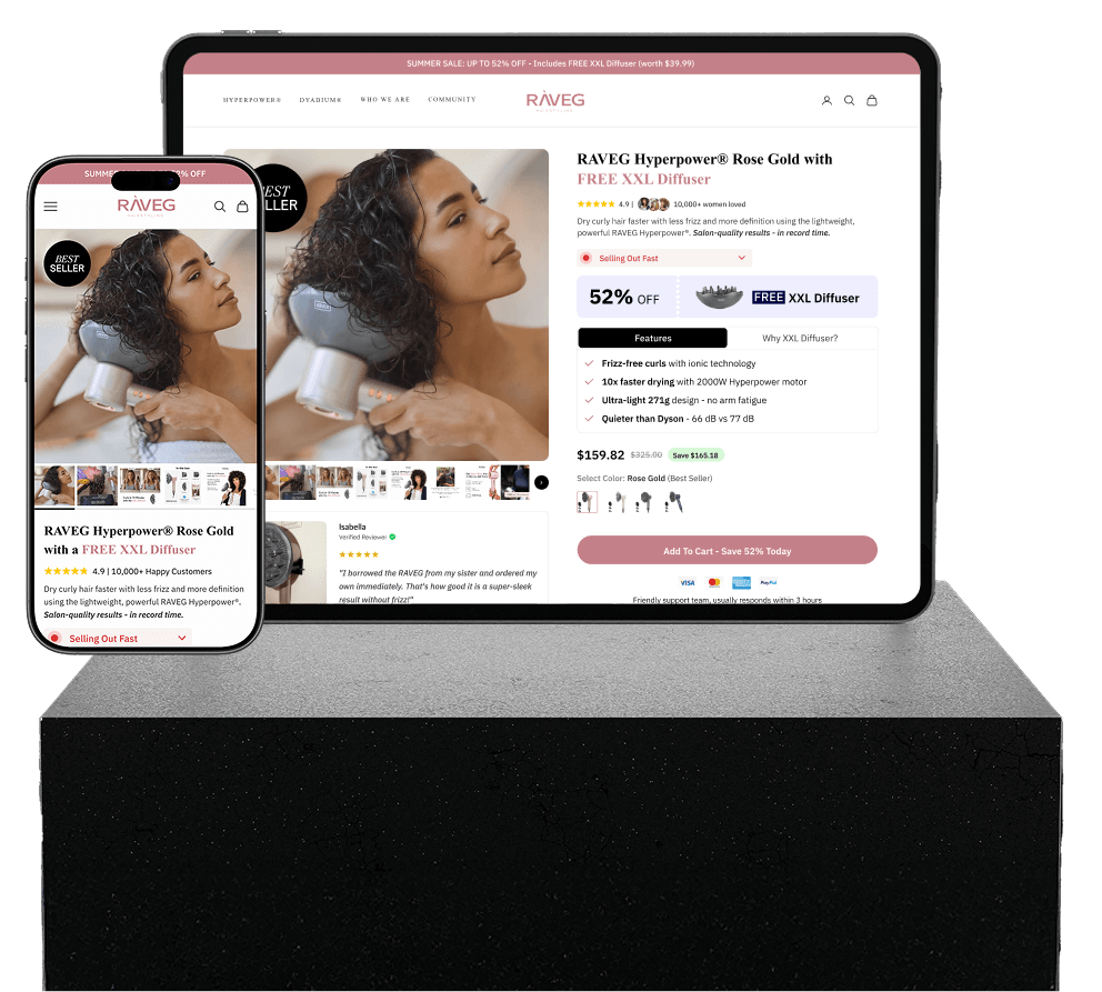
Visual Comparison
We design, test, and optimize funnels to turn traffic into consistent revenue.
We reviewed Shopify's conversion funnel to understand where visitors were abandoning the journey.
Microsoft Clarity recordings and heatmaps were used to identify:
Each issue was categorized according to:
This helped us prioritize high-impact changes instead of making a full, unvalidated redesign.
Every proposed improvement was connected to a measurable hypothesis.
Example: By moving product benefits, the free diffuser, delivery reassurance, and guarantee closer to the Add to Cart button, more mobile visitors will understand the offer and proceed to cart.
Mobile-first page variations were prepared and implemented inside Shopify.
Page variations were monitored using Shopify and A/B testing tools.
Winning ideas were retained, while unsuccessful changes were treated as learning opportunities.
The process continued through smaller, evidence-led improvements rather than one large redesign.
We design, test, and optimize funnels to turn traffic into consistent revenue.
We reviewed the product, formula, audience, likely objections and the questions customers needed answered before purchasing.
We assessed the existing information hierarchy, purchase section, trust signals, product explanation and mobile experience.
The content was reorganized around the customer journey:
The new structure was implemented with conversion-focused sections, clearer messaging and stronger purchase support.
Spacing, content length, button visibility and section hierarchy were reviewed specifically for mobile traffic.
Shopify product-sales performance was reviewed after launch to measure the commercial impact of the redesigned page.
See what Founders and CMOs are saying.
Rated 5 stars by 300+ investors